library(tidyverse)
library(readxl)
fung <- read_excel("dados-diversos.xlsx",
"fungicida_campo")Scatter plot
Scatter plot
Duas variáveis relacionadas.
a função size dentro do ggplot, muda o tamanho dos pontos.
fung |>
  ggplot(aes(trat, sev)) +
  geom_jitter(width = 0.1, color = "gray") + stat_summary(fun.data = mean_se, color = "black")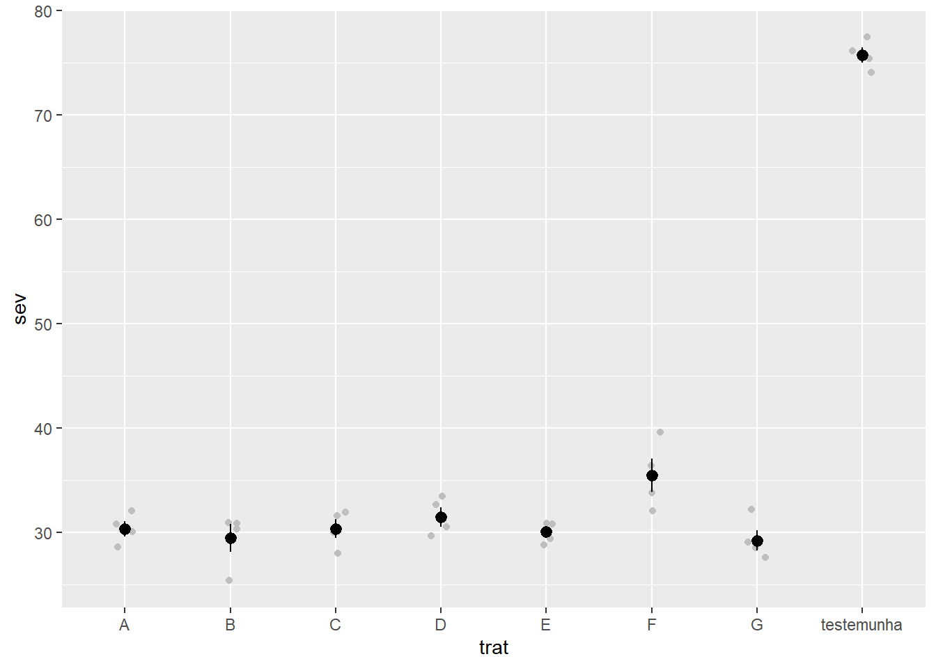
Gráfico de regressão linear, mas só colocando a reta, sem calcular os parâmetros
fung |>
   ggplot(aes(sev, yld))+
  geom_point(alpha = 0.5, color = "gray50")+
  scale_color_binned()+
  geom_smooth(method = "lm",
              se = FALSE,
              color = "black",
              linetype = "dashed",
              size = 1)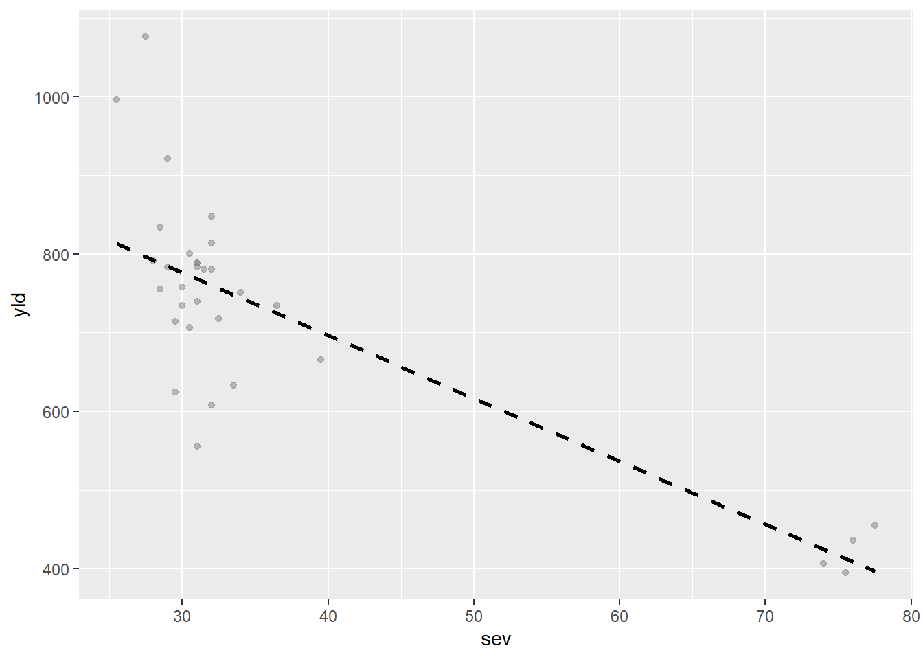
milho <- read_excel("dados-diversos.xlsx",
                    "milho")


milho |>
   ggplot(aes(method, yield, color = method))+
     geom_point()+
  facet_wrap(~hybrid)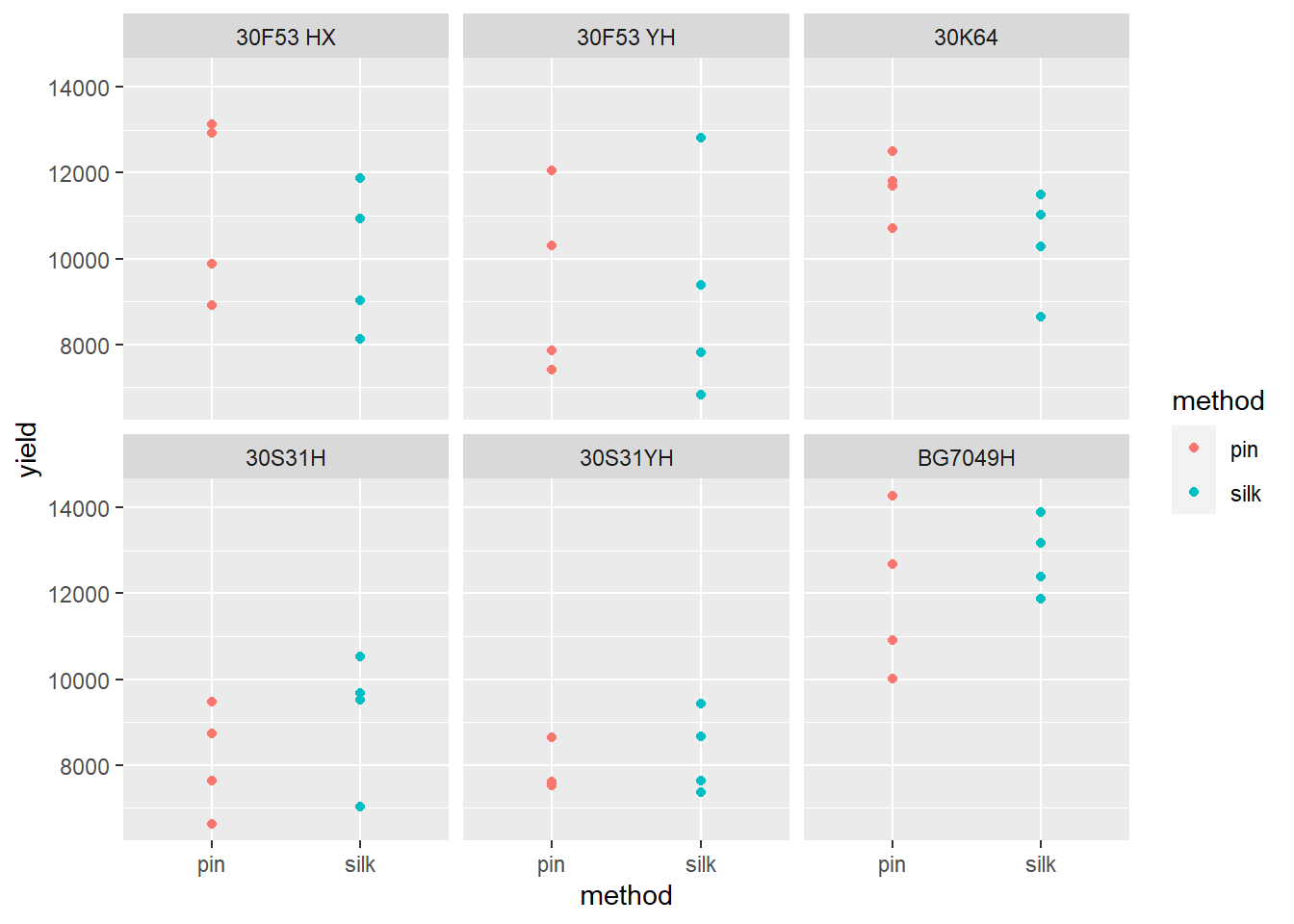
milho |>
   ggplot(aes(method, yield, color = method))+
     geom_point()+
  facet_grid(~hybrid)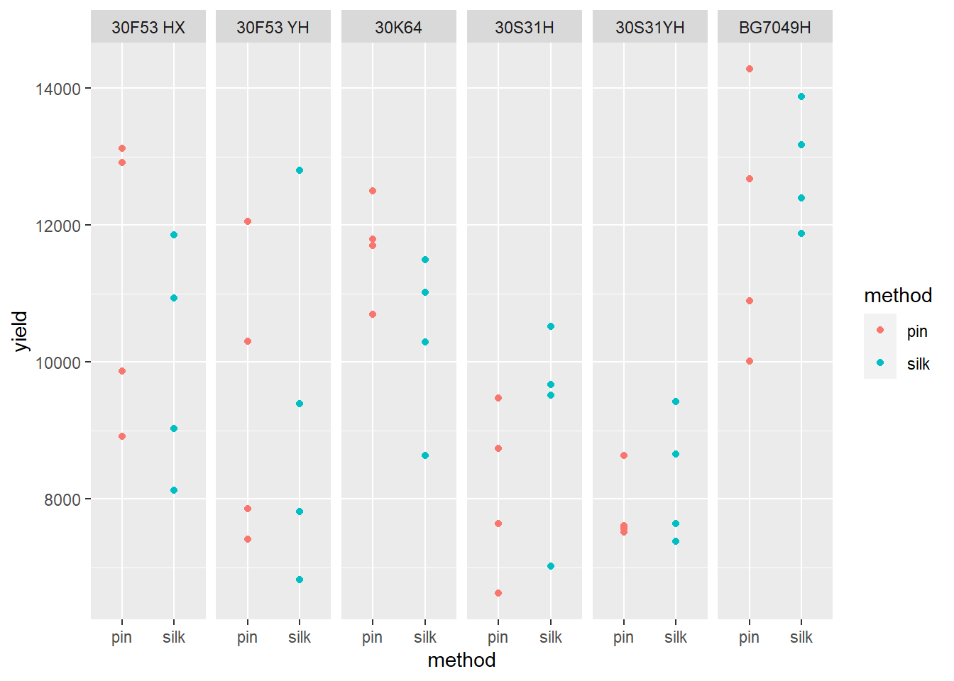
#Fazendo um histograma
g1 <- milho |>
   ggplot(aes(x= yield))+
     geom_histogram(bins = 10, color = "gray40", fill = "gray80")+
  theme_classic()

g2 <- milho |>
   ggplot(aes(x= index))+
     geom_histogram(bins = 10, color = "gray40", fill = "gray80")+
  theme_classic()

milho |>
   ggplot(aes(x= index))+
     geom_density()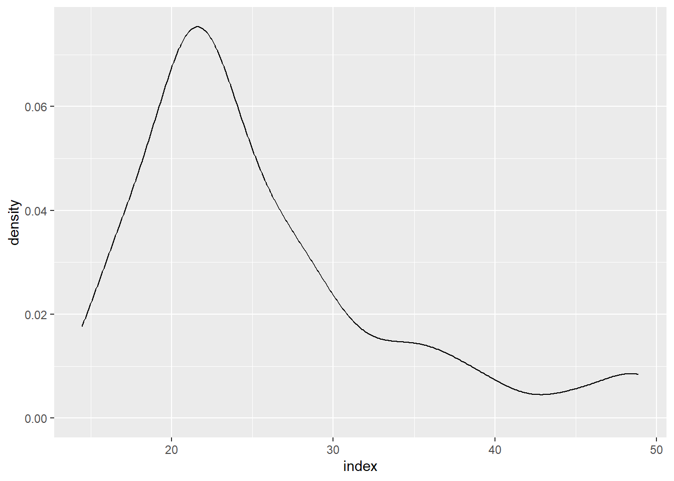
library(patchwork)
(g1 | g2)+
  plot_annotation(tag_levels = 'A', title= 'Gráfico Milho')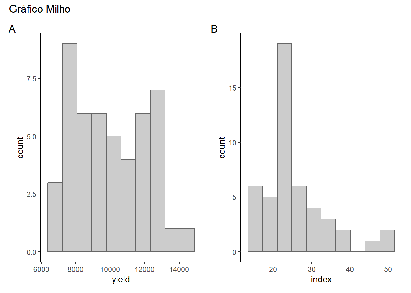
ggsave("figs/histograma.png",
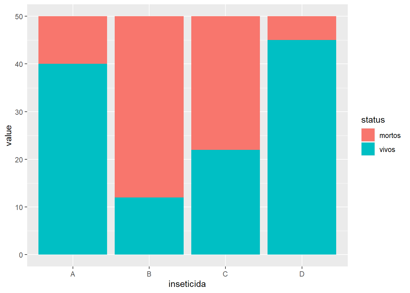
bg = "white", width = 6, height= 4)insect <- read_excel("dados-diversos.xlsx", "mortalidade")
insect |>
pivot_longer(2:3,
names_to = "status",
values_to = "value") |>
ggplot(aes(inseticida, value,
fill = status))+
geom_col()